There's so much to love about Firefox 3 on the mac.
But why can't they get the toolbar right?
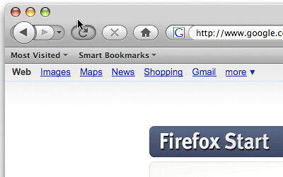
It now has a correct faded look when unfocussed but they still can't get the unified toolbar right.
Look where the mouse is. You could (maybe, kinda) forgive them for not making a click at that point a drag action.
What you can't forgive is that it is a button click when the pointer is clearly outside the bounds of the button.
You'd be amazed how annoying it is.
Or maybe you wouldn't.
17 May 2008
Firefox 3rc1 - Ongoing Toolbar Fail
05 April 2008
Firefox History Cleanup
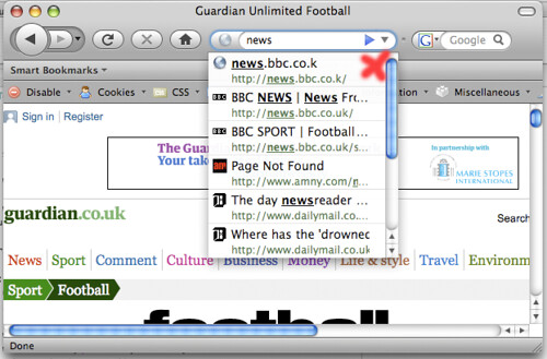
So far I'm liking Firefox 3.
I'm even getting used to the smart address bar thingemy.
But since it's so damn smart now, it feels like a missed opportunity to fix one of my biggest browser auto-complete bugbears.
How do you get rid of an erroneous (say mistyped) entry from the list? Particularly one the goes to the top of the list and obscures the thing you're really after.
I reckon a delete from history button (X marks the spot) in the drop list would do the trick.
02 February 2008
Don't say the F Word!
Friend's reunited must be running scared. They won't let you put the word "Facebook" in your profile.
How fucking sad is that?
The letter g is also a problem apparently.
15 December 2007
Security through RSI
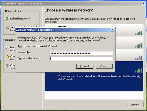
This is the most irritating dialog in Windows. Why on earth do I need to type my WEP password twice? It's a huge hexadecimal number. Is it a security feature? Are hackers really breaking into my Router by randomly typing in huge keys and are therefore deterred by having to do it twice?
What other system requires you to type a password twice to gain access (rather than to, for example, confirm a password change)?
Thanks for nothing
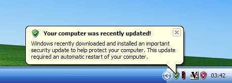
Thank you windows for installing updates and rebooting my machine while I went to get a snack.
I feel more secure now and am not even slightly narked by the loss of the data in my open, unsaved document.
23 September 2007
Pedestrian crossing frustrations
The new-style pedestrian crossing signs in the UK are the worst example of bad usability I can think of – to wit: they’re bad enough to get people killed.
I can’t remember if I’ve posted about them before, mainly because just thinking about them drives me into an apoplectic rage but Jeremy Keith has just posted about them again.
The first place I saw them was in Sheffield about four years ago (it was an early adopter apparently), but they’re just becoming more and more widespread – it’s pretty obvious that they’re replacing all the existing, excellent signs.
Let’s just spell this out:
- traffic in the UK drives on the left
- to cross a road, you must first look right
- the pedestrian crossing signs are at waist height
- there is only one of them
- they no longer make a loud beeping noise when it is safe to cross
- if there is just one person standing between you and the sign it is impossible to tell if it is safe to cross the road or not
- they are not deployed uniformly across individual cities, let alone the country, which means you have to hunt and peck to find out where your safety indicator is
- nightmare
There is quite genuinely nothing good about these displays. They are harder to see, harder to use, less obvious, give less notification and plainly dangerous.
18 September 2007
Quotation Crazy
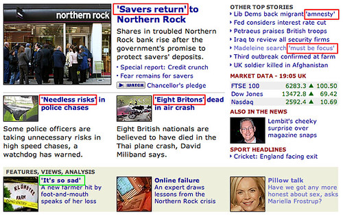
I hate the BBC's over use of quotation marks. It's so distracting. Of the 7 'quotes' * on this page, I reckon only the Foot and Mouth one really needs it.
The Police chase and Madelein McCann ones are debatable and the others are just bobbins.
Maybe it's just me but I find it so distracting.
* Can you see what I did there?
08 September 2007
Facebook apps suck ass
I quite like Facebook. Not because it is intrinsically good, because I don't think it is, but because it has gained sufficient momentum that you have a decent chance of dredging up people from your past and putting you in direct contact with them. It's like a much, much less odious Friends Reunited.
What I do I like is the idea of the applications since they incentivize you to keep interacting with these blasts from your past.
However, the interaction model of applications absolutely blows.
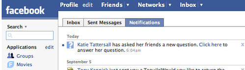
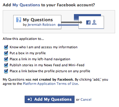
If my friend installs an app that invites a response from me (and there are lots of nice survey and question apps), why do I have to install it too if I want to respond?
Clearly what I want to do in order to answer a simple question is clutter my profile with yet another application, oh and give the developers access to my profile.
It's just asinine. Cut that shit out.
27 April 2007
Odeon: when will they learn?
Years ago there was a big hoo-ha about the Odeon cinema's totally inaccessible web site. The eventual line from the cinema was that they were coming up with a new version which would solve all of the usability problems. However they didn't actually do this for a number of years. Their web department was a national joke.
I've just used the Odeon website (which, alongside everything else, doesn't render correctly in Firefox) to book some tickets. The interface to do so is in Flash. Seriously.
They do have a "plain text" version, except that it isn't just plain text, and it should be their default interface - other than a graphic showing you where standard and superior seats are it's exactly the same, but written in HTML rather than a proprietary, inaccessible, poorly written Flash interface. There is nothing stopping them using this as their primary booking interface - it would increase usability, accessibility, improve visual consistency and create a more streamlined, efficient way to book tickets.
Let's make this clear: whoever is in charge of the Odeon website is an utter incompetent. Because of their atrocious booking system this will be my first visit in years. With the thought that I might have to use their website again, it will also be my last for years. If I'd worked on that website I would be absolutely ashamed of myself.
23 April 2007
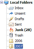
Thunderbird 2.0 Icons
I (like everyone else) hate change.
Every time I upgrade a piece of software, if the icon set changes, then as far as I am concerned it is always for the worse.
However within a week I usually can't even remember what the old icons looked like, so I have learned to quell my inner rage and just wait for my memory to fail me.
However in the case of Thunderbird 2 there is one icon that I think must be genuinely worse and that's the mail folder icon.
Just look at it. When closed it looks nothing like a folder. When open it is drawn standing on it's end which were it the real life folder it is aping would mean that all your mail fell out all over the floor.
Rubbish!
Of course given my memory, it's entirely possible that this is what the old one looked like too.
15 March 2007
Where is 'No to All'?
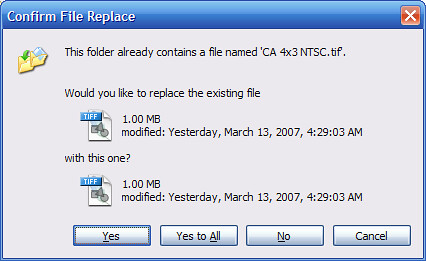
My big network copy has crapped out.
I start it again, and I can either waste the time it takes to copy the files that are already copied and risk it crapping out again.
Or I can sit and press 'No' for the hundreds of files that have already copied.
Bastards
11 March 2007
Spring Forward
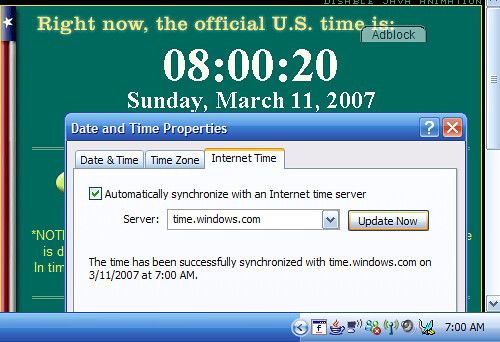
I expected the computer to get this wrong.
I didn't expect time.windows.com to be wrong as well.
Curiously, fixing the hour and hitting 'Update Now' did not revert to the wrong time, so maybe it is just the computer.
For what it's worth, the Mac 'Just Worked'.
17 September 2006
It Just Works
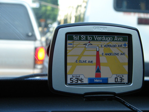
I spend my whole time whining about how much I hate this or that application.
So it's a rare pleasure to have something as simple and effective as my Sat Nav.
We bought it, slapped it on the windscreen, pressed the most obvious buttons and drove straight to our destination.
There's a big manual that comes with it but I see no reason to use it.
You can enter an address, you can search for a business by name, you can even browse local resteraunts by food type.
When it's giving the directions it is clear and concise and it even has a choice of US or British english voices.
The screen is crisp and clear and the maps are simple and pretty with nice anti aliased curves and text.
I simply cannot fault it in any way.
Gosh.
19 July 2006
When is today?
After reading an interesting article about ID cards it was nice to see this at the bottom:
 But wait! He's discussing it today? Even though he wrote the article a week ago? Sounds unlikely to me. It sounds like what I really want is an mp3 from last week instead.
So, you have to scroll back to the top of the page to find out when "today" is, then find the podcasts blog index, then navigate backwards in time until you find the correct podcast title (Newsdesk) for the correct day, scan the description, and make sure that it's the content you were after. And all for the sake of a correct link.
Please Guardian, I like that you're doing all these new and exciting things, but make the little things easier to use, please?
But wait! He's discussing it today? Even though he wrote the article a week ago? Sounds unlikely to me. It sounds like what I really want is an mp3 from last week instead.
So, you have to scroll back to the top of the page to find out when "today" is, then find the podcasts blog index, then navigate backwards in time until you find the correct podcast title (Newsdesk) for the correct day, scan the description, and make sure that it's the content you were after. And all for the sake of a correct link.
Please Guardian, I like that you're doing all these new and exciting things, but make the little things easier to use, please?
11 April 2006
Meaningless marketing jargon
The BBC have decided that the word "podcast" isn't good enough anymore, and so for their BBC Radio News podcast have christened it their "Newspod", which whilst it might sound great in some high-powered caffeinne-fuelled meeting, is completely meaningless out of context, and contains only marginal meaning for those who know what the hell they're talking about.
Losers.
12 March 2006
del.icio.us is now an anti-social bookmarking site
del.icio.us have updated their URL bookmark history page, so that now, if for example I look at the history for http://www.eclipsezone.com/eclipse/forums/t65486.rhtml on http://del.icio.us/url/bd8e17cc6069d2573d00b525059c9eed, instead of first being told "8 people have bookmarked this, here they are, and here are there comments" it now says "8 people have bookmarked this, and hey, if you want to find out who they are, just, y'know, look around the page, I'm sure you'll find it somewhere".
How completely useless is that? The user discoverability and browsability (i.e. a huge part of the social networking system that del.icio.us has at its core) is now a definite second-class citizen. Congratulations del.icio.us! Even the tags applied to that URL are now more important! That's not retarded at all, honest!
What a fucking joke. I wonder if a Yahoo! UI team started giving recommendations or something, because after all, we all know that they're the masters of clean understandable web applications.
2lmc also point out the fucking useless page titles.
23 February 2006
Ben Hammersley is wrong and iWeb is rubbish for consumers
Ben Hammersley defends the fact that iWeb's output is the antithesis of good Web practice:
No one visits Amazon to marvel at their URL structure. No one cares that Google uses last century'’s markup. No one uses Flickr because of the Ajax. Buzzwords won't save you.

Look where the text is when you load a page. And 'cause it's an image it's never going to wrap or resize so I'm forced to fit my browsing habits to the page and not vice versa as it should be. Plus it must be an absolute joy for the partially sighted, they can't scale the text and I'd bet dollars to donuts that screen readers struggle even though the text is hidden in the HTML.
Finally I can't cut and paste so getting that quote out was an exciting hunt through View Source. So on one level he's right, consumers could care less about buzzwords and nice URLs but on the other hand, the experience iWeb is producing is still absolutely rubbish.Validation porn has had its day. Enough about the brushes already: give me some beauty.Or you could give me some usamajility!
03 February 2006
IE Se7en Part 2
| Phil | i can't believe thy've taken away the word "back" on the back button |
| it was the only good thing in IE | |
| i even wrote a firefox extension to duplicate it! :) | |
| i can't believe it insists on using http:// every time | |
| ah, it doesn't always | |
| weird | |
| G | i am having all sorts of bother typing in addresses |
| although I can't pin down what the problem is | |
| ff clearly does *something* nicer than IE | |
| I just don't know what :) | |
| Phil | heh |
| you know the toolbar to the right of the tabs? | |
| G | yeah |
| Phil | can you get that to be on its own toolbar? |
| i can't | |
| G | No |
| Phil | great |
| G | Only the toolbars that you turn on and off in the toolbars option are actually toolbars |
| Phil | i can move it horizontally, but not vertically |
| perfect | |
| G | indeedly |
| makes for some narrow tab action | |
| Phil | exactly |
| what a complete pain the arse | |
| and whenever you want to go to the first tab, you can't just go to the very left of the tab bar, but X pixels in | |
| these people have clearly never heard of postel's law ;) | |
| but then again, the first tab in firefox is indented by about 3 pixels, bu at least you expect that | |
| G | i've just spotted the chevrons on the edge of that toolbar on the right |
| Help is off the screen along with all the extra buttons that apps like XML Spy and Fiddler have added | |
| Phil | yes, same here |
| G | help |
| invisible! | |
| Phil | genius! |
| G | and no help menu either! |
| Phil | excellent! |
| G | Also, all the buttons have the little down arrows on them |
| but only half of them are smart push ones | |
| But instintively i aim for the tiny arrow when I don't need to | |
| Phil | yes, it's hard to predict how they work until you hover over it |
| or rather, hover, look, pause, think, click | |
| G | The only indication of smartness is a faint vertical line that is only there when you hover |
| utter bullshit | |
| Phil | yes, it's shit |
| i also can't believe they've taken away right-click customise toolbar | |
| that's like a decade of muscle memory for every MS app ever | |
| oh i see, you can right click on the tools to the right of the tabs to get to "customise", just nothing else | |
| so annoying that the tabs resize, and yet there's no generic "close tab" button on the right of all the tabs | |
| so if you want to close three tabs in one go, you have to keep moving the mouse | |
| not just click-click-click | |
| G | not so fussed about that |
| safari is like that so used to it :) | |
| and if there's just 1 x , i prefer it in the tab to on the side | |
| Phil | yes |
| but the tab shouldn't resize in that case | |
| it should always be in a predictable location | |
| because once you close one tab, the others all resize and the location you think you were going to, moves |
IE Se7en Part 1
| Phil | I'm massively underwhelmed by IE7 |
| whether the main menu toolbar appears is tab-specific? | |
| none of the RSS stuff works for me | |
| G | heh |
| the only thing I've liked so far is | |
| right click next to the tabs and select "Restore last tab group" | |
| gosh | |
| Phil | meh |
| G | yeah, the whole thing is so underwhelming |
| It's like Opera | |
| it's capable enough | |
| but why would you? | |
| Phil | they've moved the motherfucking main menu, which completely destroys my spatial understanding of everything above the browser window |
| G | yes |
| Well by default the main menu isn't there at all | |
| which is interesting | |
| but shit :) | |
| Phil | yes |
| i can't turn it back on by default | |
| i keep hitting alt+f to get it back | |
| G | It's a toolbar |
| "Classic Menu" | |
| Phil | ??? where the fuck is that? |
| G | Tools, Toolbars, Classic Menu |
| Phil | oh jesus |
| Phil | mother |
| fucker |
02 February 2006
IE 7 Clear Type

Oh look, it turns on clear type to totally muddy my reading experience on my CRT!
Great.
Bonus points for doing it in my Outlook email as well.
Thanks!
Subscribe to:
Posts (Atom)