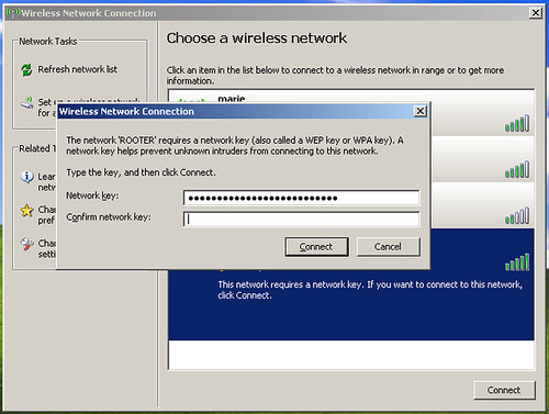
This is the most irritating dialog in Windows. Why on earth do I need to type my WEP password twice? It's a huge hexadecimal number. Is it a security feature? Are hackers really breaking into my Router by randomly typing in huge keys and are therefore deterred by having to do it twice?
What other system requires you to type a password twice to gain access (rather than to, for example, confirm a password change)?
15 December 2007
Security through RSI
Thanks for nothing
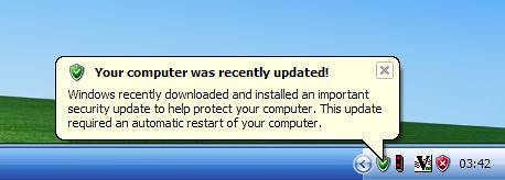
Thank you windows for installing updates and rebooting my machine while I went to get a snack.
I feel more secure now and am not even slightly narked by the loss of the data in my open, unsaved document.
23 September 2007
Pedestrian crossing frustrations
The new-style pedestrian crossing signs in the UK are the worst example of bad usability I can think of – to wit: they’re bad enough to get people killed.
I can’t remember if I’ve posted about them before, mainly because just thinking about them drives me into an apoplectic rage but Jeremy Keith has just posted about them again.
The first place I saw them was in Sheffield about four years ago (it was an early adopter apparently), but they’re just becoming more and more widespread – it’s pretty obvious that they’re replacing all the existing, excellent signs.
Let’s just spell this out:
- traffic in the UK drives on the left
- to cross a road, you must first look right
- the pedestrian crossing signs are at waist height
- there is only one of them
- they no longer make a loud beeping noise when it is safe to cross
- if there is just one person standing between you and the sign it is impossible to tell if it is safe to cross the road or not
- they are not deployed uniformly across individual cities, let alone the country, which means you have to hunt and peck to find out where your safety indicator is
- nightmare
There is quite genuinely nothing good about these displays. They are harder to see, harder to use, less obvious, give less notification and plainly dangerous.
18 September 2007
Quotation Crazy
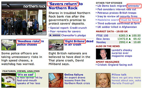
I hate the BBC's over use of quotation marks. It's so distracting. Of the 7 'quotes' * on this page, I reckon only the Foot and Mouth one really needs it.
The Police chase and Madelein McCann ones are debatable and the others are just bobbins.
Maybe it's just me but I find it so distracting.
* Can you see what I did there?
08 September 2007
Facebook apps suck ass
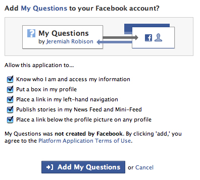
I quite like Facebook. Not because it is intrinsically good, because I don't think it is, but because it has gained sufficient momentum that you have a decent chance of dredging up people from your past and putting you in direct contact with them. It's like a much, much less odious Friends Reunited.
What I do I like is the idea of the applications since they incentivize you to keep interacting with these blasts from your past.
However, the interaction model of applications absolutely blows.
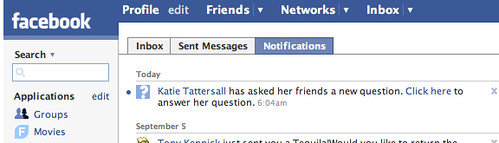
If my friend installs an app that invites a response from me (and there are lots of nice survey and question apps), why do I have to install it too if I want to respond?
Clearly what I want to do in order to answer a simple question is clutter my profile with yet another application, oh and give the developers access to my profile.
It's just asinine. Cut that shit out.
27 April 2007
Odeon: when will they learn?
Years ago there was a big hoo-ha about the Odeon cinema's totally inaccessible web site. The eventual line from the cinema was that they were coming up with a new version which would solve all of the usability problems. However they didn't actually do this for a number of years. Their web department was a national joke.
I've just used the Odeon website (which, alongside everything else, doesn't render correctly in Firefox) to book some tickets. The interface to do so is in Flash. Seriously.
They do have a "plain text" version, except that it isn't just plain text, and it should be their default interface - other than a graphic showing you where standard and superior seats are it's exactly the same, but written in HTML rather than a proprietary, inaccessible, poorly written Flash interface. There is nothing stopping them using this as their primary booking interface - it would increase usability, accessibility, improve visual consistency and create a more streamlined, efficient way to book tickets.
Let's make this clear: whoever is in charge of the Odeon website is an utter incompetent. Because of their atrocious booking system this will be my first visit in years. With the thought that I might have to use their website again, it will also be my last for years. If I'd worked on that website I would be absolutely ashamed of myself.
23 April 2007
Thunderbird 2.0 Icons
I (like everyone else) hate change.
Every time I upgrade a piece of software, if the icon set changes, then as far as I am concerned it is always for the worse.
However within a week I usually can't even remember what the old icons looked like, so I have learned to quell my inner rage and just wait for my memory to fail me.
However in the case of Thunderbird 2 there is one icon that I think must be genuinely worse and that's the mail folder icon.
Just look at it. When closed it looks nothing like a folder. When open it is drawn standing on it's end which were it the real life folder it is aping would mean that all your mail fell out all over the floor.
Rubbish!
Of course given my memory, it's entirely possible that this is what the old one looked like too.
15 March 2007
Where is 'No to All'?
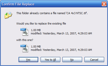
My big network copy has crapped out.
I start it again, and I can either waste the time it takes to copy the files that are already copied and risk it crapping out again.
Or I can sit and press 'No' for the hundreds of files that have already copied.
Bastards
11 March 2007
Spring Forward
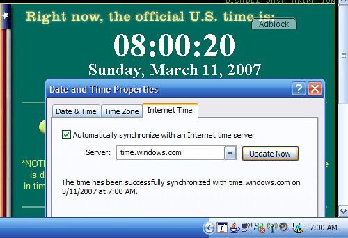
I expected the computer to get this wrong.
I didn't expect time.windows.com to be wrong as well.
Curiously, fixing the hour and hitting 'Update Now' did not revert to the wrong time, so maybe it is just the computer.
For what it's worth, the Mac 'Just Worked'.
Subscribe to:
Posts (Atom)