I (like everyone else) hate change.
Every time I upgrade a piece of software, if the icon set changes, then as far as I am concerned it is always for the worse.
However within a week I usually can't even remember what the old icons looked like, so I have learned to quell my inner rage and just wait for my memory to fail me.
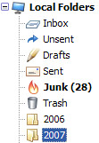
However in the case of Thunderbird 2 there is one icon that I think must be genuinely worse and that's the mail folder icon.
Just look at it. When closed it looks nothing like a folder. When open it is drawn standing on it's end which were it the real life folder it is aping would mean that all your mail fell out all over the floor.
Rubbish!
Of course given my memory, it's entirely possible that this is what the old one looked like too.
2 comments:
I don't think so, I think it's just rubbish. I think the new flame icon is stupid too. I'll do a comparison at work tomorrow - I've not upgraded yet.
Well said.
Post a Comment